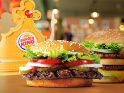
American fast-food restaurant Burger King has rebranded for the first time in 20 years with a revamped logo, packaging and uniforms designed by creative agency Jones Knowles Ritchie.
Burger King has carried out a comprehensive rebrand to update all elements of its visual identity with a design that it describes as "mouthwatering, big and bold, playfully irreverent and proudly true".
As part of this revamp the fast-food chain has ditched its previous logo, introduced in 1999, in favour of a flat design that is more aligned with the logo used by the brand throughout the 1970s, 80s and 90s.
As with the pre-1999 designs, the simplified logo is more clearly two bun halves sandwiching the words Burger King.
"We were inspired by the brand's original logo and how it has grown to have an iconic place in culture," explained Jones Knowles Ritchie. "The new logo pays homage to the brand's heritage with a refined design that's confident, simple and fun."


